Introduction
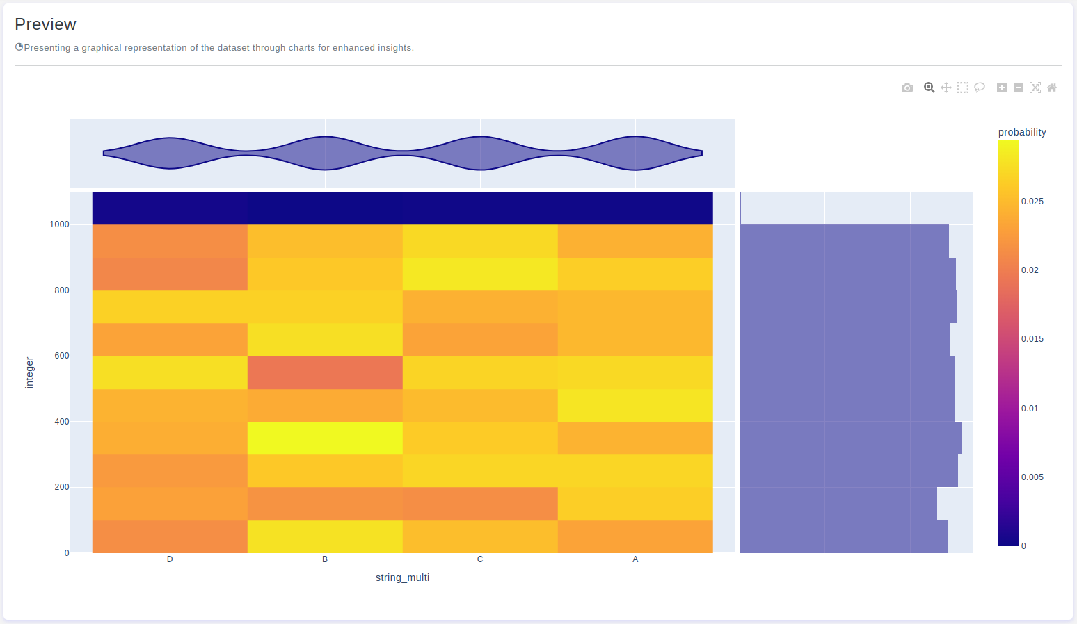
The Density Heatmap Chart is a versatile visualization tool used to display the density of data points across a two-dimensional space using color gradients. It helps in identifying patterns, trends, and areas of high or low concentration within the dataset. OtasML, a visual machine learning tool, includes a Density Heatmap Chart feature in its data preparation model. This guide explains how to configure the Density Heatmap Chart feature for effective data visualization.
Configurations
The Density Heatmap Chart tool in OtasML offers various configuration options, allowing users to customize the visualization according to their specific needs. Below are the key configurations and options available:
Subset
- Default Value: None
- Description: This option allows users to select specific columns for visualizing their data. By specifying the subset of columns, users can focus on the data values of interest, ensuring the density heatmap chart provides meaningful insights.
Height
- Default Value: None
- Description: This option allows users to provide a specific height value for the chart. Only integer values are allowed, and this helps maintain the aspect ratio of the chart, ensuring the visualization remains clear and proportional.
Histfunc
- Default Value: Count
- Description: Specifies how the data should be aggregated and represented within each cell of the histogram-like grid that forms the basis of the density heatmap plot. Users can choose from several functions:
Count:Each cell represents the count of data points within that cell, indicating data density.Sum:Each cell represents the sum of a specified numerical variable within that cell.Avg:Each cell represents the average (mean) of a specified numerical variable within that cell.Min:Each cell represents the minimum value of a specified numerical variable within that cell.Max:Each cell represents the maximum value of a specified numerical variable within that cell.
Marginal X
- Default Value: None
- Description: Refers to additional one-dimensional density plots that show the distribution of data along the X-axis. These plots are displayed on the sides of the main two-dimensional density plot, providing insights into the distribution of the X variable.
Marginal Y
- Default Value: None
- Description: Refers to additional one-dimensional density plots that show the distribution of data along the Y-axis. These plots are displayed on the sides of the main two-dimensional density plot, providing insights into the distribution of the Y variable.
Histnorm
- Default Value: None
- Description: Allows users to control how the data is normalized or scaled when creating the contour plot based on a histogram-like representation. Users can choose from several normalization options:
Percent:Data is normalized to show the percentage of data points within each cell.Probability:Data is normalized so that the integral over the entire range is 1, turning the histogram into a probability density function.Density:Data is normalized to create a density estimate, where the integral over the entire range is the total number of data points.
X
- Default Value: None
- Description: The x-axis represents the values of the dataset. Users can define which values will be represented along the x-axis.
Y
- Default Value: None
- Description: The y-axis represents the cumulative proportion or count of data points that are less than or equal to each value on the x-axis. Users can define how the cumulative distribution will be represented.
Z
- Default Value: None
- Description: The Z values represent the density of data points within each grid cell. Higher Z values indicate higher density, which is usually depicted using a color gradient.
Interactive Button: Preview
To enhance user experience and provide greater control over the Density Heatmap Chart visualization, the tool includes a Preview button:
Preview:This button allows users to see the effects of their configuration in real-time without permanently applying the changes. By clicking Preview, users can visually assess how the Density Heatmap Chart will appear based on the current configurations, ensuring that the visualization is appropriate before committing to any changes.
Conclusion
The Density Heatmap Chart tool in OtasML provides a comprehensive solution for visualizing data density in a two-dimensional space. By allowing users to select specific columns, customize colors, and define aggregation and normalization options, the tool offers flexibility and control over the data visualization process. The inclusion of an interactive Preview button further enhances the user experience, ensuring confidence in the Density Heatmap Chart configuration. OtasML continues to empower users with intuitive and effective tools, making data visualization a seamless and integral part of the machine learning workflow.