Introduction
Sunburst charts are a powerful visualization tool for displaying hierarchical data in a circular format, providing an intuitive way to explore data relationships and distributions. OtasML, a visual machine learning tool, includes a Sunburst Chart feature within its data preparation model. This feature enables users to create detailed and customizable sunburst charts, enhancing their ability to understand complex datasets. This article details how to configure the Sunburst Chart feature for effective data visualization.
Configurations
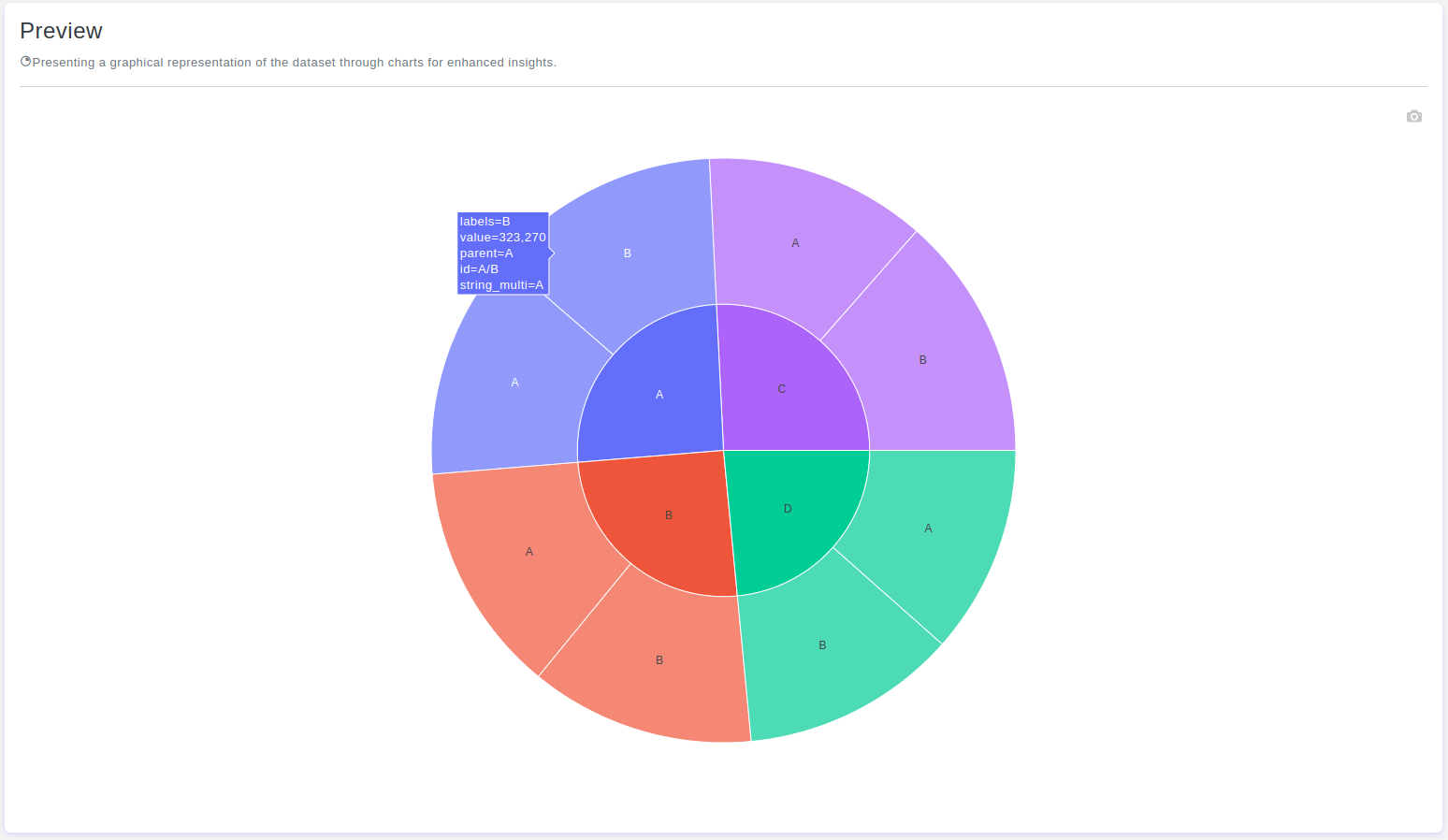
The Sunburst Chart tool in OtasML offers various configuration options, allowing users to customize the visualization to meet their specific needs. Below are the key configurations and options available:
Subset
- Default Value: None
- Description: This option allows users to select specific columns for visualizing their data. By specifying the subset of columns, users can focus on the hierarchical relationships of interest, ensuring the sunburst chart provides meaningful insights.
Height
- Default Value: None
- Description: Provide a specific height value for the chart. Only integer values are allowed. Setting a height helps maintain the aspect ratio of the chart, ensuring that the visualization is clear and well-proportioned.
Color
- Default Value: None
- Description: This option allows users to specify the color of different elements in the chart. By customizing the colors, users can enhance the visual appearance of the chart, making it easier to distinguish between different levels of the hierarchy.
Value
- Default Value: None
- Description: Determines the size of each sector relative to the whole sunburst chart. The size of each sector is proportional to the values associated with that sector, and the sum of all values at a particular level of the hierarchy represents the total value of that level.
Interactive Button: Preview
To enhance user experience and provide greater control over the sunburst chart visualization, the tool includes a Preview button:
Preview:This button allows users to see the effects of their configuration in real-time without permanently applying the changes. By clicking Preview, users can visually assess how the sunburst chart will appear based on the current configurations, ensuring that the visualization is appropriate before committing to any changes.
Conclusion
The Sunburst Chart tool in OtasML provides a versatile solution for visualizing hierarchical data. By allowing users to select specific columns, set the chart height, customize colors, and define the value parameter, the tool offers flexibility and control over the data visualization process. The inclusion of an interactive Preview button further enhances the user experience, ensuring confidence in the sunburst chart configuration. OtasML continues to empower users with intuitive and effective tools, making data visualization a seamless and integral part of the machine learning workflow.