Introduction
Scatter 3D charts are powerful visualization tools that allow users to explore relationships between three variables simultaneously, offering a three-dimensional perspective on their data. OtasML, a visual machine learning tool, includes a Scatter 3D Chart feature within its data preparation model. This feature enables users to create customizable 3D scatter plots, providing deeper insights into the data's structure and correlations. This article explains how to configure the Scatter 3D Chart feature to enhance your data visualization.
Configurations
The Scatter 3D Chart tool in OtasML offers various options for customizing and visualizing data points in three dimensions, allowing users to tailor the appearance and dimensions of their charts. Below are the key configurations and options available:
Subset
- Default Value: None
- Description: This option allows users to select specific columns for visualizing their data. By specifying the subset of columns, users can focus on the variables of interest, ensuring that the scatter 3D chart provides meaningful insights.
Height
- Default Value: None
- Description: Provide a specific height value for the chart. Only integer values are allowed. Setting a height helps maintain the aspect ratio of the chart, ensuring that the visualization is clear and well-proportioned.
Color
- Default Value: None
- Description: This option allows users to specify the color of different elements in the chart. By customizing the colors, users can enhance the visual appearance of the chart, making it easier to distinguish between different data points and elements.
X
- Default Value: None
- Description: The x-axis represents the values of the dataset. This option allows users to specify which column should be used for the x-axis, providing control over how the data is plotted horizontally.
Y
- Default Value: None
- Description: The y-axis represents the values of the dataset. This option allows users to specify which column should be used for the y-axis, providing control over how the data is plotted vertically.
Z
- Default Value: None
- Description: The z-axis represents the values of the data points along the third axis, creating a three-dimensional representation of the data. This option allows users to specify which column should be used for the z-axis, providing control over how the data is plotted in three dimensions.
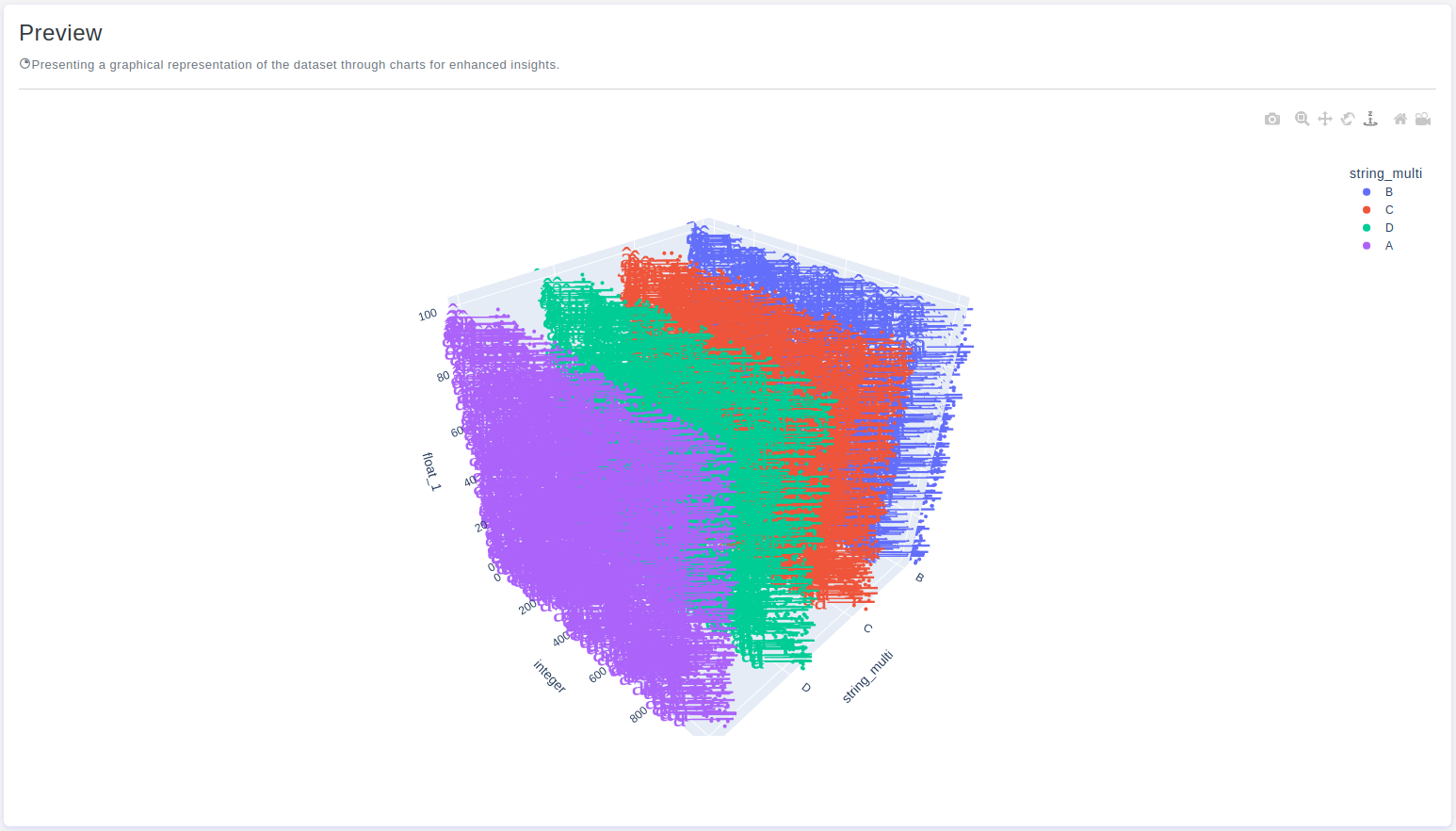
Interactive Button: Preview
To enhance user experience and provide greater control over the scatter 3D chart visualization, the tool includes a Preview button:
Preview:This button allows users to see the effects of their configuration in real-time without permanently applying the changes. By clicking Preview, users can visually assess how the scatter 3D chart will appear based on the current configurations, ensuring that the visualization is appropriate before committing to any changes.
Conclusion
The Scatter 3D Chart tool in OtasML provides a versatile solution for visualizing relationships between three variables in a dataset. By allowing users to select specific columns, set the chart height, customize colors, and define the x, y, and z axes, the tool offers greater flexibility and control over the data visualization process. The inclusion of an interactive Preview button further enhances the user experience, ensuring confidence in the scatter 3D chart configuration. OtasML continues to empower users with intuitive and effective tools, making data visualization a seamless and integral part of the machine learning workflow.