Introduction
Histograms are an essential tool for visualizing the distribution of a dataset. OtasML, a visual machine learning tool, includes a Histogram Chart feature within its data preparation model. This feature allows users to create detailed and customizable histograms, enhancing their ability to understand the distribution of their data. This article details how to configure the Histogram Chart feature for effective data visualization.
Configurations
The Histogram Chart tool in OtasML offers various configuration options, allowing users to customize the visualization to meet their specific needs. Below are the key configurations and options available:
Subset
- Default Value: None
- Description: This option allows users to select specific columns for visualizing their data. By specifying the subset of columns, users can focus on the distribution of interest, ensuring the histogram provides meaningful insights.
Height
- Default Value: None
- Description: This option allows users to provide a specific height value for the chart. Only integer values are allowed, and this helps maintain the aspect ratio of the chart, ensuring the visualization remains clear and proportional.
Color
- Default Value: None
- Description: This option allows users to specify the color of different elements in the chart. By customizing the colors, users can enhance the visual appearance of the chart, making it easier to distinguish between different parts of the histogram.
X
- Default Value: None
- Description: The x-axis represents the values of the dataset. Users can define which data values will be represented along the x-axis, ensuring the histogram accurately reflects the distribution of these values.
Y
- Default Value: None
- Description: The y-axis represents the cumulative proportion or count of data points that are less than or equal to each value on the x-axis. Users can define how the frequency or density of the data points will be represented.
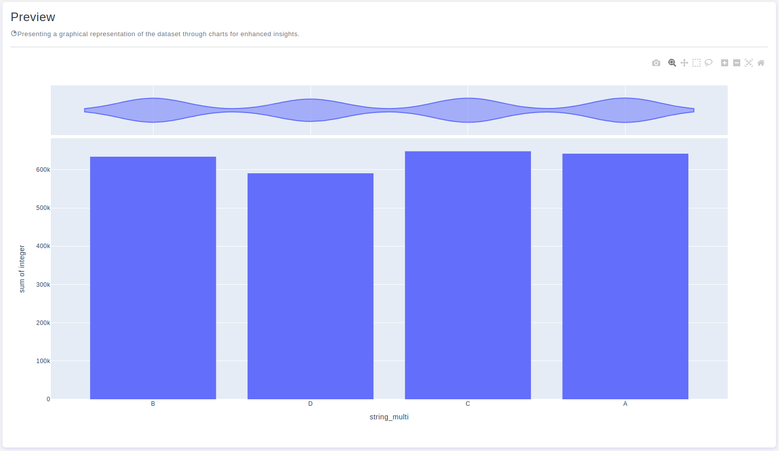
Marginal
- Default Value: None
- Description: Refers to additional graphical elements that provide extra insights into the distribution of the data being analyzed. These marginal elements are typically visualizations, such as box plots or density plots, placed along the axes of the histogram to help you understand the data from different perspectives.
Interactive Button: Preview
To enhance user experience and provide greater control over the histogram visualization, the tool includes a Preview button:
Preview:This button allows users to see the effects of their configuration in real-time without permanently applying the changes. By clicking Preview, users can visually assess how the histogram will appear based on the current configurations, ensuring that the visualization is appropriate before committing to any changes.
Conclusion
The Histogram Chart tool in OtasML provides a versatile solution for visualizing data distributions. By allowing users to select specific columns, customize colors, define the x and y axes, and include marginal elements, the tool offers flexibility and control over the data visualization process. The inclusion of an interactive Preview button further enhances the user experience, ensuring confidence in the histogram configuration. OtasML continues to empower users with intuitive and effective tools, making data visualization a seamless and integral part of the machine learning workflow.